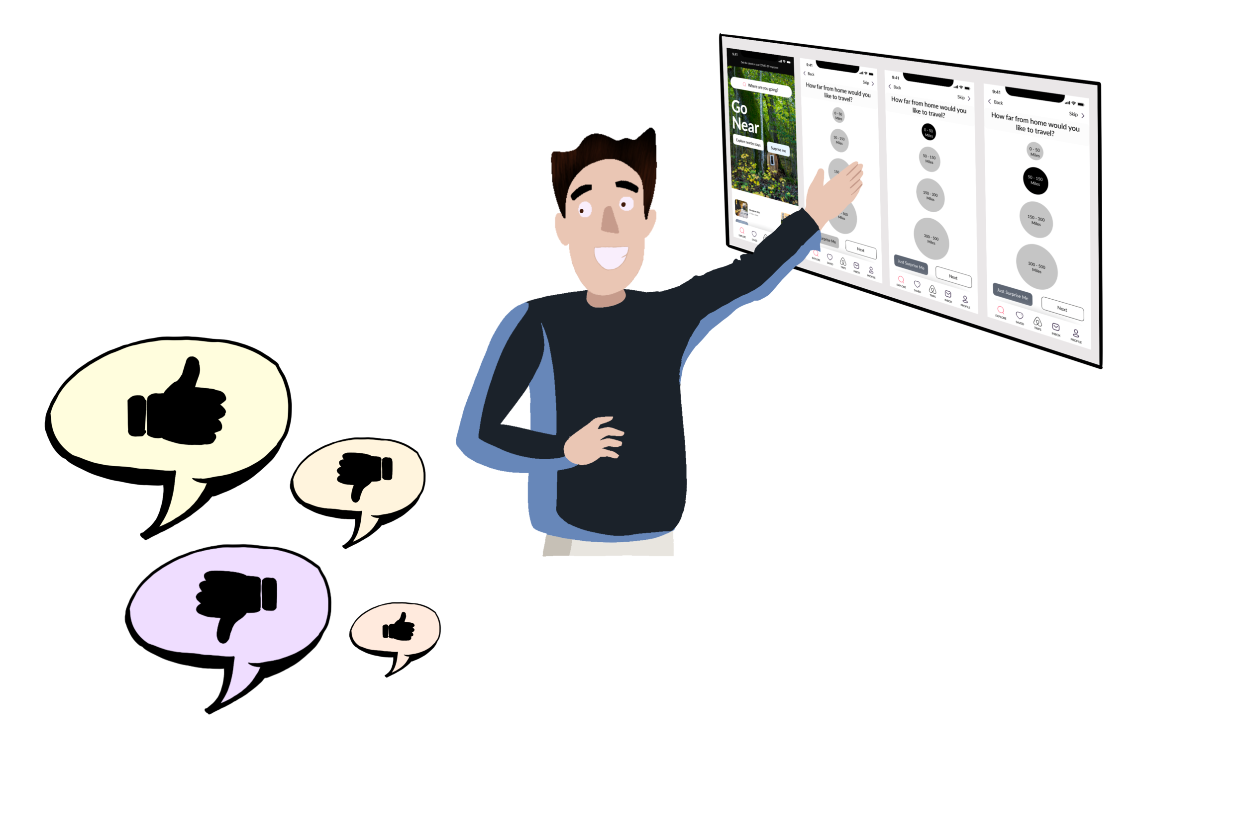
Surprise Me - A new feature for Airbnb’s “Go Near” section
A simple, intuitive, and functional feature called “Surprise Me” which selects destinations for indecisive travelers after a quick walkthrough of their preferences.
Overview
Airbnb is a vacation rental online marketplace company which also maintains and hosts a marketplace, accessible to consumers on its website or via its app. My challenge was to add a simple, intuitive, and functional feature called “Surprise Me” which selects destinations for indecisive travelers after a quick walkthrough of their preferences. I set out to design a solution that would meet the needs of the target user who wants to travel locally and make the app a pleasure to use.
Project Length: 3 weeks
My Role: Research, interaction design & visual design
The Opportunity
In a post-COVID world, travel is no longer the way it used to be.
Many studies have concluded that people are more hesitant to travel.
People most of the times are confused and cannot decide on the available options either due to lack of proper visibility or just the sheer volume of options available.
In such a world, Airbnb’s “Go Near” is an excellent feature which offers travelers a chance to “rediscover the magic in their own backyards.”
But I feel that this already amazing feature is missing a key component.
Helping out people with the inability to make decisions.
With so many great options to chose from, users get confused and just cannot decide on a particular trip, since it involves making a lot of decisions such as budget, location, number of people, safety of the destination, distance from home, etc.
This indecision often leads them ultimately not to pick anything.
The Proposal …
The goal here is to build a simple, intuitive, and functional feature called “Surprise Me” which selects destinations for indecisive travelers after a quick walkthrough of their preferences, including distance from home, budget, and dates.
Design Process
Starting from identifying the opportunity through concept sketching, prototyping, evaluation, and iterating, the design process is quite straightforward, intended to be simple and effective. The only step where I faced a hurdle was in determining its impact on a large user base.
User Research
The Survey…
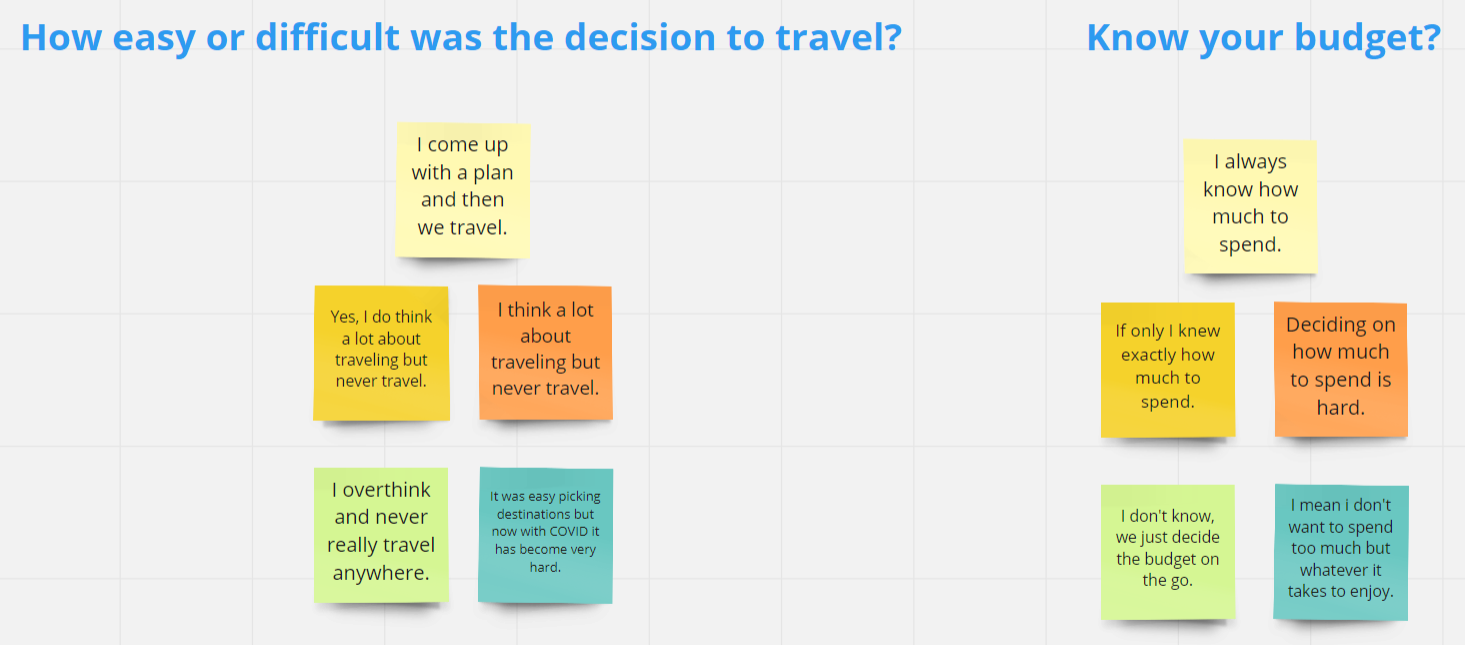
I started by making a list of survey questions to determine the right user to interview. The users who I could see this feature being most helpful to are those who either used to travel a lot or love to travel in general but are unable to make that decision now in an everchanging travel world.
The keyword is indecision. How many people always know where they want to go and how many spend a lot of time just trying to decide where to go because of either too many or too few options?
The Interviews…
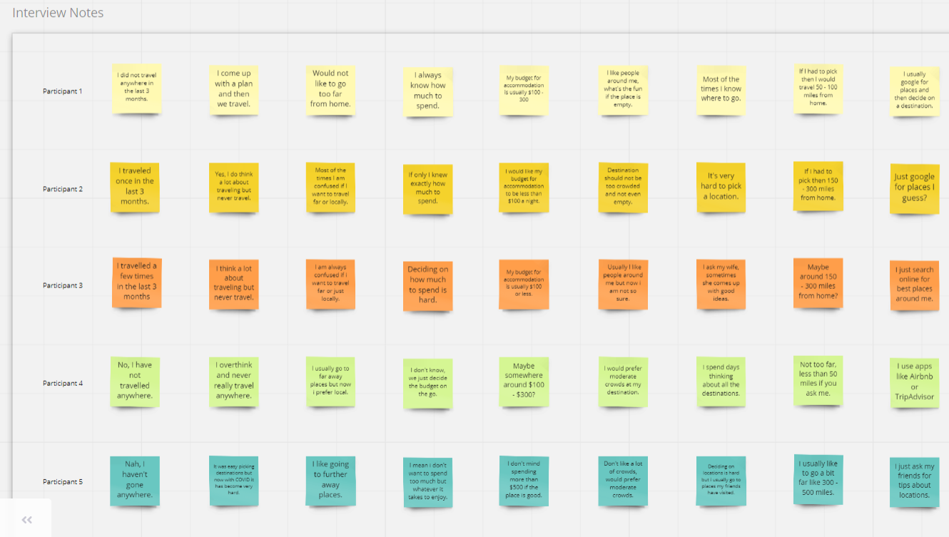
After selecting the right people through the survey and screening questions, I interviewed many travelers to determine how exactly they make a decision to travel or not and if they do, what the foremost things they consider are before making that decision.
Key findings…
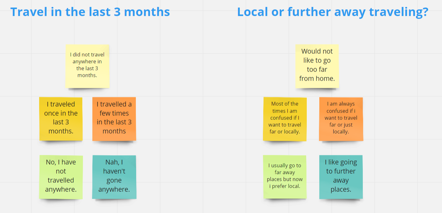
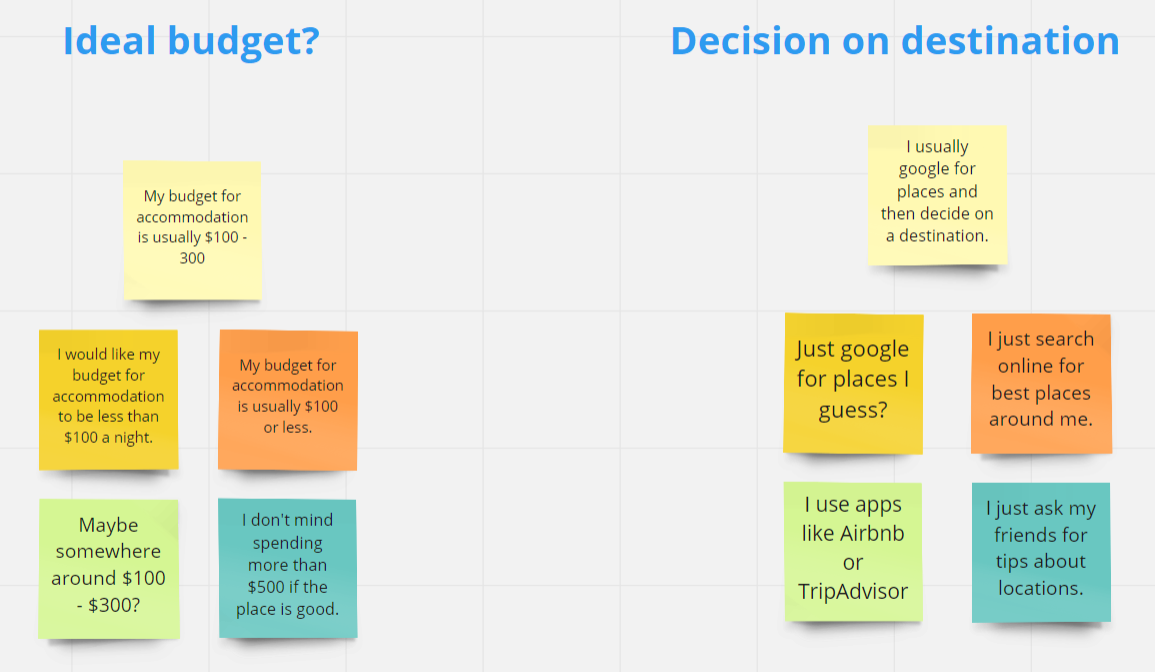
Most people in the interviews said that they do want to travel more but end up overthinking and going nowhere due to the inability to decide on many factors, such as distance from home or zeroing in on a budget or just when to travel.
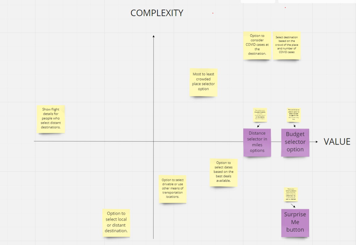
The goal now would be to design a simple and intuitive functionality which is clutter free and selects the destination for the user by presenting 3 simple and easy to select options:
Distance in radius.
Budget range.
Date ranges or an option to select things like “this weekend”, “next weekend”, “in next 2 weeks” etc.

Ideation
User-Flow Diagram
I sketched out a typical user journey based on how a user would accomplish this specific task within the app. Once the user journey had been determined, I began to draw a design flow for the use cases.

Conceptualization and Sketching
After obtaining the basic requirements of the user from the interviews, the key features were identified and ideated through sketching which helped me quickly get an idea of how the feature is going to shape up.


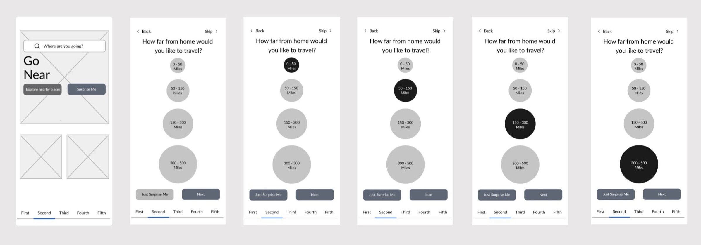
Low-Fi Prototypes
These prototypes are a level up from the initial sketches but simple enough to get an initial feedback from the users. It gave me a way to visually explore the features conceptualized in the initial sketches.

Test & Feedback
Design Critic …
After creating the lo-fi prototypes, I hopped on a video call with the same people I conducted the interviews with and asked them for their opinions. While there were many positive feedbacks, I also got quite a few constructive criticism thereby helping me improve the prototypes.
Accessibility Improvements
After talking to a few people and then running tools like contrast checker, I have noticed that I could improve the accessibility features of this app. For example increasing the weight of the text where and when possible and changing the colors of the button to make them look more prominent and easy to the eye.
Iterate & Improve
High-Fi Prototypes
After the initial round of feedback from the users, I sat down to create a set of Hi-Fi prototypes which gave me and the people who were giving me feedback and easy way to visualize how the end product would look like.
Second Round of feedback
Having a prototype which is closer to the end product helped the users to give me more constructive feedback and criticism, which helped me go back to the drawing board again to make the required changes.
Final Iterations…
After listening to the user feedback and observing the Key Performance Indicators, I made the following changes to the app:
Added more contrast to the clickable options and buttons.
Added more colors to them to make them pop and be more readable and discoverable.
Added drop shadows to give a visual cue to the user as to what they are clicking on.
I shared my final clickable prototype with the same users with whom I had been collaborating, and they were very pleased with the usability of the feature.

Final Feedback and Impact
I shared my final clickable prototype with the same users with whom I had been collaborating, and they were very pleased with the usability of the feature. They loved the fact that there was a feature dedicated for local travelers and they wished for a similar feature in the Airbnb app.


